

Loading page content
Loading
Preparing your experience
Please wait while we fetch the latest data and prepare the page for you.
Loading
Preparing your experience
Please wait while we fetch the latest data and prepare the page for you.
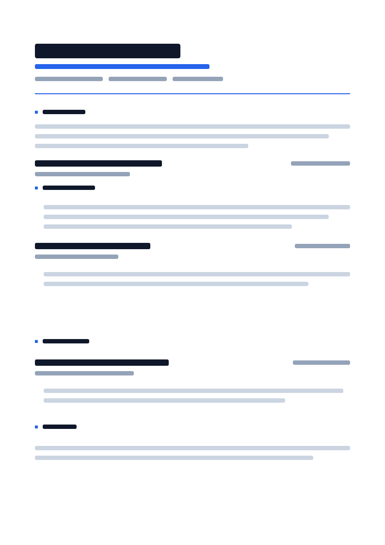
The signature VeriWorkly resume: a quiet, editorial layout built around one confident name treatment and three precise touches of brand accent - a rule, a label, and a set of small marks. Nothing else competes for attention, and nothing sits in a table or a column a parser could misread.
Primary fit
Applications where a calm, confident first page reads better than a loud one.
Full document preview
Rendered from the production template asset
Fit report
Veriworkly Special spends its entire color budget on three deliberate moments: a tight-tracked name in ink, a wide-tracked accent label under it, a thin accent rule closing the header, and a small accent mark opening each section. Everything else - dates, bullets, body copy - is plain text in a single column, so the three accent touches read as a signature rather than decoration competing with the content.
Target audience
Applications where a calm, confident first page reads better than a loud one.
Candidates who want the polish of a designed document without risking a layout a parser cannot read.
Pairing with the VeriWorkly Special cover letter for a matched, understated application set.
The layout is not just a skin. These choices decide what recruiters see first and how the exported document scans.
Typography
A large, tight-tracked name that carries hierarchy through size and weight, not color.
Typography
A wide-tracked, uppercase accent label under the name - the one place the brand color touches text directly.
Typography
Small, consistent accent marks before each section title instead of a filled background.
Design direction
Veriworkly Special spends its entire color budget on three deliberate moments: a tight-tracked name in ink, a wide-tracked accent label under it, a thin accent rule closing the header, and a small accent mark opening each section. Everything else - dates, bullets, body copy - is plain text in a single column, so the three accent touches read as a signature rather than decoration competing with the content.
The template is designed around the first human scan before decorative detail.
Spacing and hierarchy keep exported pages readable, credible, and easy to compare.
The system balances visual distinction with safe structure for the document type.
Template behavior
Exports from the document editor using production template assets.
Template behavior
Keeps typography and spacing consistent with the selected document family.
Template behavior
Uses editor-ready content regions rather than flat image-only previews.
Name, accent label, contact row, and links sit above a single thin accent rule - no fills, no panels.
Each heading opens with one small accent square and a tracked uppercase label, keeping rhythm without a filled chip.
Experience, education, and skills stay single column and text-only underneath the quiet header and headings.